HEIDI FAWN ART AND DESIGN
  • HOME
  • ABOUT
  • Services
    • ParentChild
    • Live Painting >
      • Live Wedding Painting
      • Live Event Painting
    • Youth Art Lessons
    • Graphic Design
  • SHOP
    • Custom Artwork
    • Original Paintings
    • Prints
    • Etsy Shop
  • Contact

Previous Projects

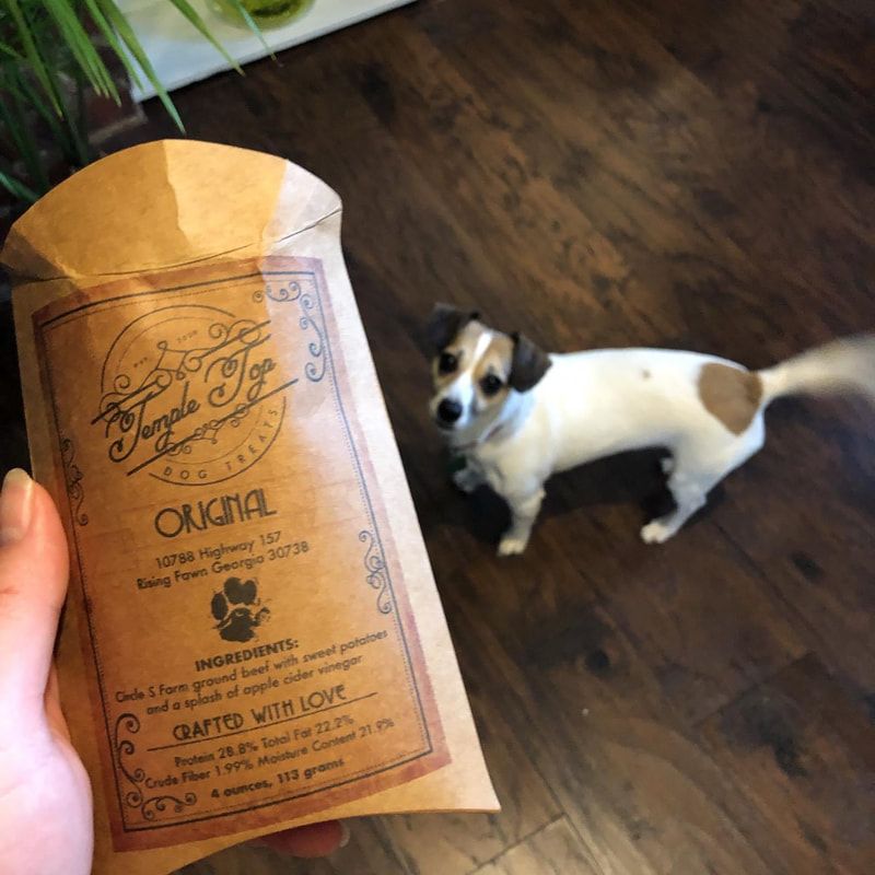
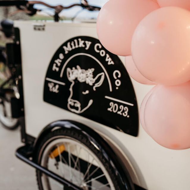
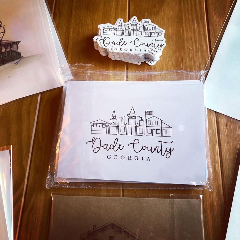
Over the years, I have had the pleasure of working with hundreds of clients for their graphic design needs. Below are a few that I hold near and dear to my heart!

The Milky Cow Co.

CLICK PHOTOS TO ENLARGE
The Milky Cow Co. branding was such a fun balance to bring to life. We wanted something that felt whimsical and inviting, but still elevated enough to sit beautifully in a wedding setting.

The hand-drawn cow with her little flower crown adds a soft charm, while the overall design stays clean and refined. I leaned into creamy neutrals with a few gentle pops of color, inspired by a classic ice cream palette, so it feels light, joyful, and a little nostalgic without being overly bright or busy.
​
From the cart to the packaging, everything was designed to feel cohesive and intentional. The end result is a brand that feels sweet and approachable, but still polished enough to belong in those really special, meaningful moments.

Check out The Milky Cow Co.'s storefront in Collegedale, TN, and their website!

Temple Top Dog Treats

CLICK PHOTOS TO ENLARGE
Temple Top Dog Treats was a deeply meaningful project, centered around honoring the client’s beloved pup. The paw print used throughout the design is taken from their late dog, making the branding feel personal and rooted in love.

From there, I leaned into a natural, wholesome direction. The warm, earthy tones were chosen to reflect organic, raw ingredients and a back-to-basics approach to pet care. Everything about the palette and texture is meant to feel grounded and simple.
​
To tie it all together, I brought in subtle vintage label elements to give it a timeless, handcrafted feel. The end result is a brand that feels heartfelt and trustworthy, with just enough character to stand out while still honoring the story behind it.

The Book & Easel

CLICK PHOTOS TO ENLARGE
The Book & Easel logo was created to feel like a quiet corner you don’t want to leave. A place where books are open and paint is still drying.

At the center, an open book rests on an easel, bringing together two things I love most: storytelling and creating. This was a reflection of the club's dual purpose: Bringing stories and art together. The tiny star details add a hint of wonder, like some of those moments you find inside a good book.

The colors lean into that cozy feeling; Rich, moody tones balance with softer, warm neutrals like a lamplit evening at home. Paired with classic serif typography, it all comes together in a way that feels timeless, a little nostalgic, and a bit whimsical.

Support

Terms and Conditions
​Privacy Policy 
​Disclaimer

Subscribe to Newsletter
© COPYRIGHT 2022. ALL RIGHTS RESERVED.
  • HOME
  • ABOUT
  • Services
    • ParentChild
    • Live Painting >
      • Live Wedding Painting
      • Live Event Painting
    • Youth Art Lessons
    • Graphic Design
  • SHOP
    • Custom Artwork
    • Original Paintings
    • Prints
    • Etsy Shop
  • Contact